Saje Body Redesign
Servicespackaging design
strategy
CreditsART DIRECTION: BREANNA MUSGROVE
SENIOR DESIGN: KATIE MAASIK
PHOTOGRAPHY: KORNELIA KULBACKI
PRODUCTION: CYNTHIA LY
COPY: JESS FLANAGAN + NATALIE AYBARS
overview
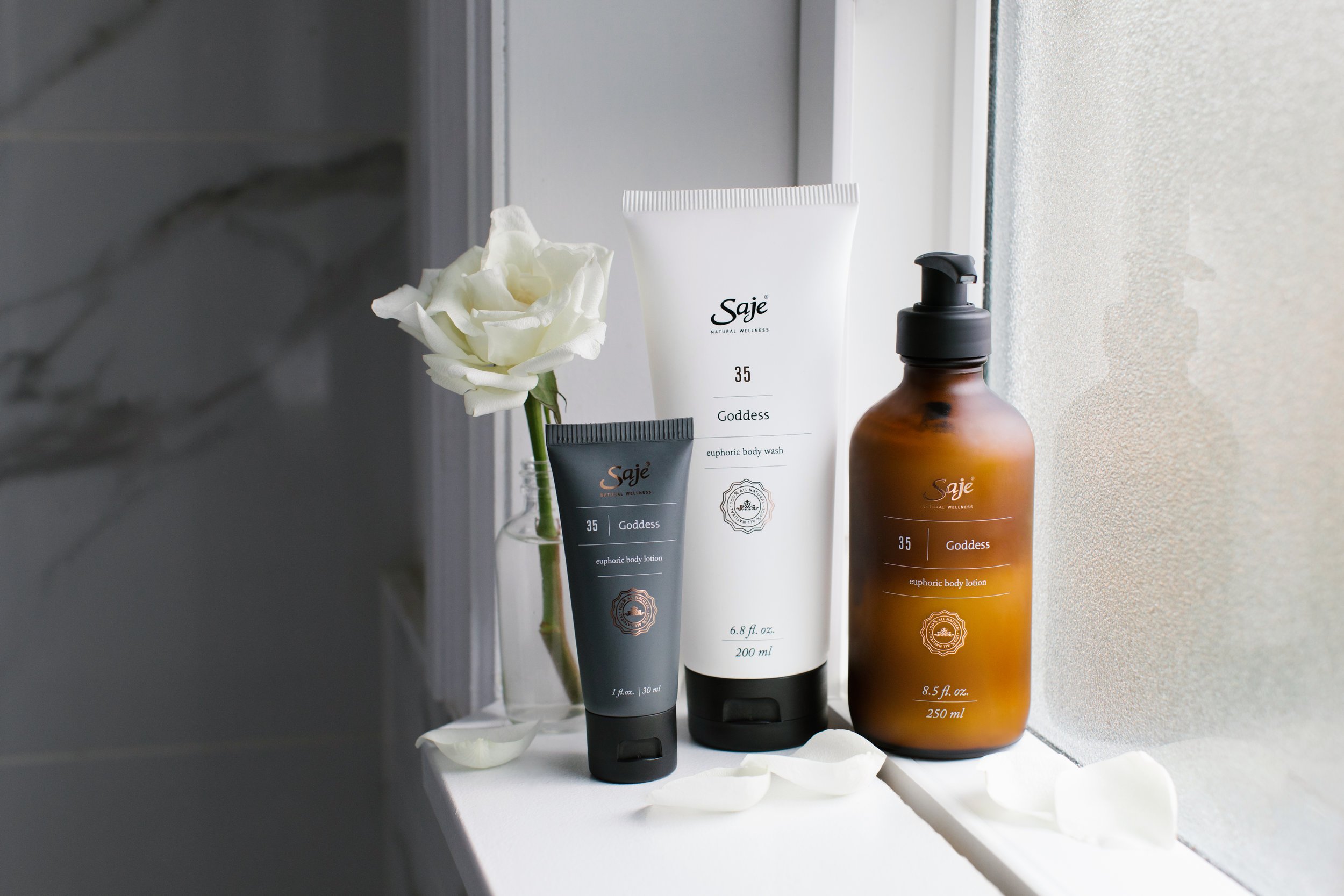
After a decade of not being touched, the Body Line at Saje needed a lift — a redesign that would stay true to the roots of the brand, while also acknowledging its immense growth and fresh modernity over the past decade. The line had seen considerable growth in these years, currently spanning multiple different scent lines within a deep product offering. Shopability of the line was a pain point among Team Members, with many remarking that the packaging was too cluttered for legibility and too similar in shape for differentiation.
goal
With this redesign, our goal was to highlight the values and strength of Saje, that of providing a modern twist on ancient aromatherapy with powerful natural remedies that beautifully and seamlessly fit into your life. We also focused on improving legibility and shelf presence within stores and online.
outcome
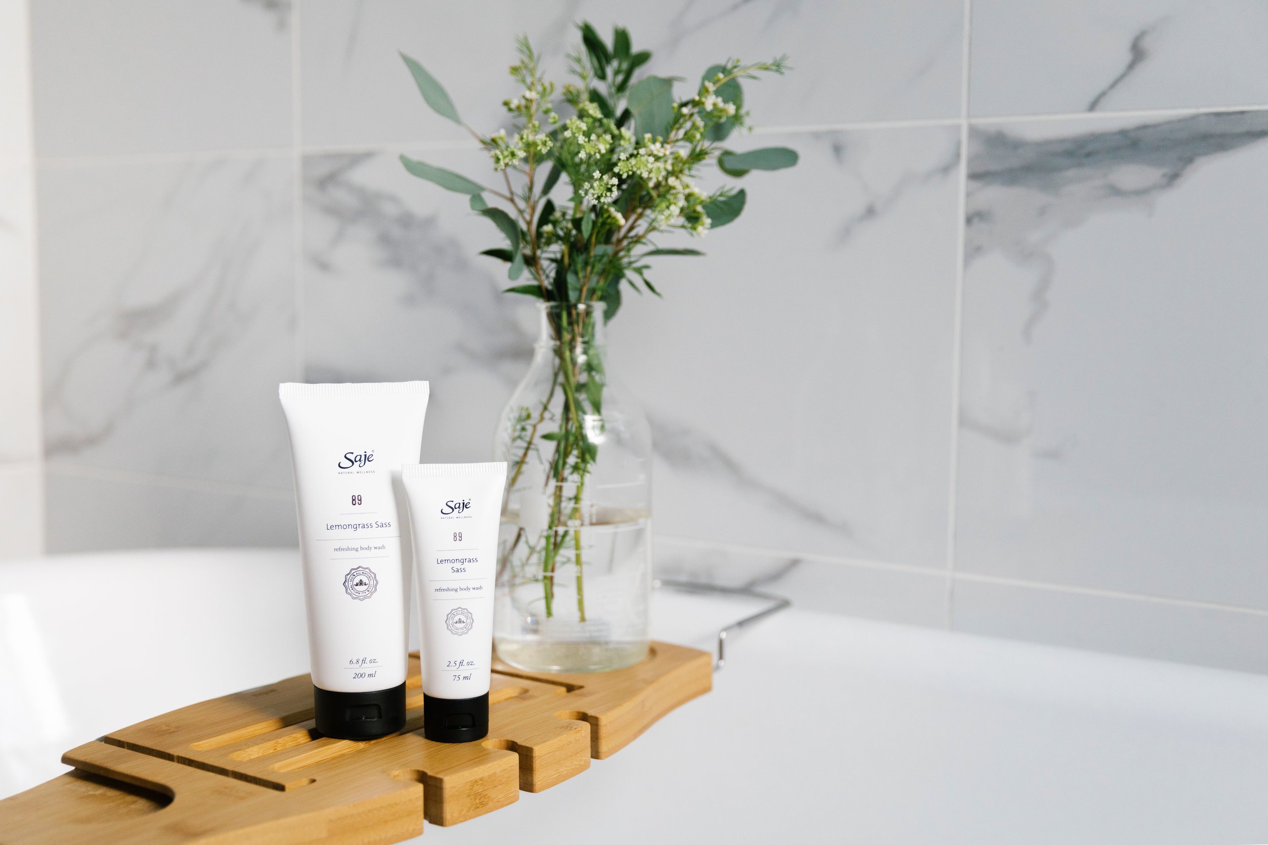
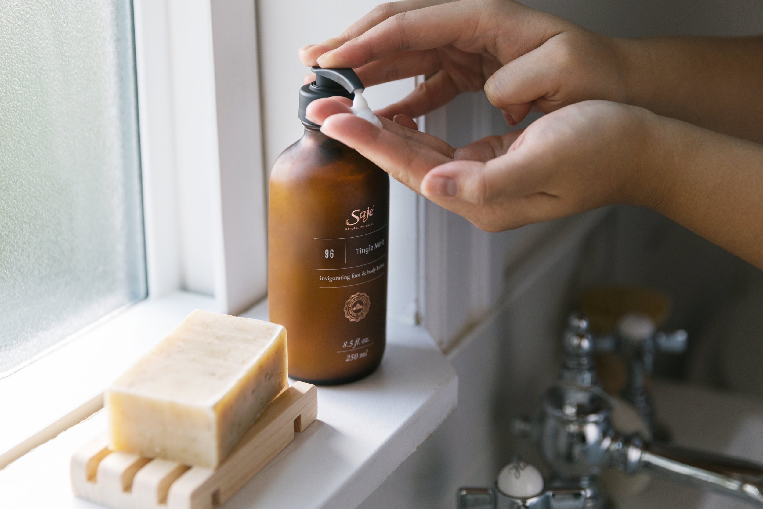
Working through several options, we landed on Modern Apothecary as our guiding star: an updated and simplified aesthetic that retains the warmth of the original packaging, while helping it mature. We pulled in traditional apothecary elements with the copper accents and amber glass bottles, which protect the delicate essential oils. To balance this, we used a simplified colour palette of just white, black, and a cool grey. When paired with a gridded type system, the overall look is balanced and modern in tone.
We saw an immediate lift in sales after launch, and sales have continued to be solid years afterwards, with UGC rates on social media improved as well.
Saje’s Body Lineup before redesign


